


The Everything Bubble – Waiting For The Pin
March 12, 2018
Yesterday we noted that financial markets have become completely uncoupled from reality and that the recent feeble bounces between the 20-day and 50-day chart points were essentially the rigor mortis of a dead bull. As it happened, we were able to share those sentiments with what remains of CNBC’s audience of carbon-based units:
As we also noted as per the chart point mavens, the 20-day average down at 2703 (red line) on the S&P 500 was supposed to represent “support” while the 50-day average (blue line) purportedly functioned as “resistance”.
Well, upon the official announcement of the Donald’s lunatic trade war, there she sat at yesterday’s close – less than one point under the 50-day moving average at 2739.8 (blue line).
But rather than “resistance”, which the raging robo-machines ripped through today like a hot knife through butter, we’d say the blue line represents the last frontier of sanity. That’s because a stock market trading at 25X earnings under today’s baleful circumstances is nothing less than a brobdingnagian bubble (i.e. a huuuge one) frantically searching for the proverbial pin.
We essay the razor sharp aspects of the pin below, but suffice it to say here that the cyclical calendar has just plain run out of time. It is way, way too late in the cycle at 105 months of age to be “pricing-in” anything except the end of the party. And this bubblicious party has embodied the most spectacular central-bank fueled mania yet – meaning that the morning after is going to bring a truly hellacious hangover.

Among the many sharp edges of the pin are these:
- the virtual certainly of a recession within the next two years and a typical 30%-50% drop in earnings;
- the epochal Fed pivot to QT (with other major central banks to follow) and the consequent massive drainage of cash from the bond pits;
- the mad man in the Oval Office and (among other follies) his swell new Trade War, which absolutely will get out of hand globally;
- the impending “yield shock” which will thunder through the financial markets when Federal borrowing hits $1.2 trillion in the coming year – on the way to $2 trillion+ annual deficits as far as the eye can see;
- a deeply impaired underlying main street economy which is groaning under $68 trillion of public and private debt and a reverse robin hood financial regime that has left 80% of the population on welfare or struggling to make ends meet on earnings that barely keep up with inflation; and
- the swaying giant red elephant in the global economic room – meaning China’s historically unprecedented and freakish explosion of debt, manic building, monumental speculation, systematic lying and fraud and serpentine centralized command-and-control that is destined to end in a spectacular implosion.
Yet the financial system has been so corrupted by the central bank’s long-running regime of financial asset inflation and price falsification that it no longer recognizes anything that is important, fundamental and persisting. Instead, owing to the cult of an ever rising stock market, Wall Street is hopelessly enthrall to regency bias and context-free short-term deltas in the incoming monthly data.
The latter are virtually meaningless under today’s central bank driven Bubble Finance regime, of course, because the direction of economic causation has been reversed.
To wit, clumsy central banks in the pre-1987 world often fueled overheated credit on main street. Rising wage and consumer inflation then forced them to garrote the banking system, thereby triggering a collapse of housing, big ticket durables and CapEx. So the early onset warning indicators and the eventual fact of main street recession caused the stock market to dive.
By contrast, in a debt saturated global economy run by a linked-convoy of central banks, monetary “stimulus” does not inflate main street or real economies when they are impaled on Peak Debt. It simply inflates monumental financial bubbles in the money and capital markets – ever expanding bubbles which eventually burst.
These episodically bursting bubbles, in turn, shock the C-suites of the corporate world into desperate sprees of liquidation. That is, the dumping of employees, inventories, fixed assets and restructuring plans designed to brake the fall of their artificially inflated share prices and stock options.
Consequently, neither central bankers nor Wall Street ever see these new style recessions coming because, in fact, they can’t be detected from even an astute reading of the macro-economic tea-leaves.
Self-evidently, that’s because the triggers for recession are embedded in the interstitial bubbles of the financial markets; and while the latter may be obvious to the outsider or even a visiting Martian, they are adamantly denied by the Wall Street stock peddling apparatus and are invisible to the Fed’s financially clueless Keynesian academics and policy apparatchiks who remain glued to their macroeconomic dashboards.
Alas, the sheer resilience of main street capitalism keeps these dashboards mostly flashing green, most of the time. And it doesn’t take much to impress the bubble-besotted financial commentariat and day traders, as this current anemic recovery has amply demonstrated.
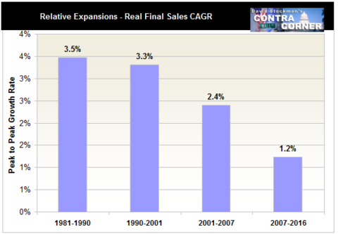
In a system so addled by phony bubble wealth, in fact, it apparently doesn’t even matter that the current expansion has generated real final sales growth of only one-third its historic rate; and that even the 1.2% growth rate shown below probably overstates the case owing to systematic and deliberate under-measurement of inflation by Washington’s officialdom.
Stated differently, the macroeconomic “new normal” has been so tepid that it has barely lifted the main street economy out of the deep hole trigged by the last financial bubble meltdown in 2008-2009. Yet as long as the monthly indicators show a smidgeon of green – as capitalism trudges uphill against the headwinds of debt and central bank induced strip-mining of corporate cash flows and balance sheets – it is apparently enough to keep the recovery narrative going.
Needless to say, we had a classic case of that this AM with the so-called “blow-out” jobs print at 313,000 for the month of February. Indeed, that number seems pretty impressive – that is, until you read the fine print on the chart below.
It seems that during the 12 month period depicted in the chart, there were five months in which the BLS establishment survey reported a gain of 300,000 or more jobs, and an average gain of 240,000 per month for the period as a whole.
Except, except. This chart ends in spring 2006!
And about 20 months later the US economy was plunging into the Great Recession.

Moreover, by October 2009, every single one of these jobs had disappeared on a net basis. In fact, the 136.1 million jobs beneath the +300,000 print in March 2006 tumbled all the way to 129.7 million before it was over.
As it happened, the March 2006 high water mark depicted above, was not recovered until May 2013 – seven full years later!
Needless to say, back then that did not stop the talking heads of bubblevision from celebrating the Goldilocks Economy and claiming that it was smooth sailing ahead because there wasn’t a hint of recession in sight.
Au contraire. There most definitely were numerous neon-lights flashing recession warnings, but they were domiciled in the canyons of Wall Street, not the BLS reports. The imminent threat to goldilocks was the manic sub-prime, credit and stock market bubbles that were being fostered there by the Greenspan Fed.
Although the Great Recession technically incepted in December 2007, the real plunge did not occur until the stock market meltdown of September-October 2008, which caused the C-suites of corporate America to begin pitching labor, inventories and assets overboard with virtually reckless abandon.
The corporate mayhem only stopped in mid-to-late 2009 (i.e., that’s when the massive monthly layoffs and inventory liquidations essentially ended) when Bernanke’s tripling of the Fed’s balance sheet caused the stock market to begin to convincingly reflate.
At that, the C-suites got their options packages re-priced to far lower levels, thereby permitting business as usual to begin slowly climbing out of the deep hole triggered by the bursting Wall Street bubble. Still, it took seven full years as documented in the chart below for the establishment payroll count to recapture its Goldilocks level of March 2006.

It is also worth noting that the BLS report made its last monthly print at 300,000 in March 2006 (actually it has now been revised multiple times to 297K, which is close enough for government work). That was month #52 of the Greenspan/housing expansion. By contrast, the US economy is now in month #105 of the Bernanke/Yellen Everything Bubble.
Still, during the last 12 months there have been only two 300,000+ prints and the average monthly employment gain has been just 190,000. That’s 21% below the 240,000 average in the 2006 chart above, and it’s in a context in which the potential labor force has grown by 29 million or 13%.
Likewise, back in 2006 the Red Ponzi was still in its relative infancy, the Fed had restored some semblance of sanity to the money market with the funds rate at 5.25% by mid-2006, and no one had yet heard of the idea of QT (quantitative tightening) because QE (quantitative easing) has not yet been invented – at least in the US context.
Stated differently, the Fed’s balance sheet was about $700 billion and had plenty of headroom to the upside. Now it is trying to crawl off the ledge at $4.4 trillion – with a destination at +/- $2.5 trillion, as the new Janet in ties and trousers explained to the Congress last week.

In as word, we don’t think the February print means anything at all – not in month #105 of a feeble business expansion which is confronting all of the headwinds described above. But as we shall explore further next week, here is the ultimate measure of Wall Street’s big, bloated, manic bubble begging to find the pin.
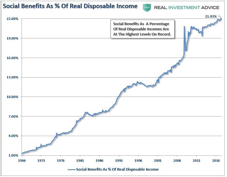
To wit, the new quarterly data on household net worth to disposable personal income is literally off-the-charts; it reflects the massive inflation of financial assets and real estate during this third and greatest central bank bubble of this century.
But here’s the thing. The underlying level of income, which is now effectively capitalized at a record 6.8X is the lowest quality income in modern times. Fully 22% of it is accounted for by transfer payments – a figure which has more than doubled since the turn of the century.
Yet how can you capitalize at more than 0.0X “income” that is extracted from producers, not generated by new output and wealth?
Social Benefits vs Incomes
Likewise, the real growth of wage and salary income relative to the pre-crisis peak has slowed to a virtual crawl. Moreover, as we will also elaborate next week, the bottom half of wage and salary workers, or 80 million persons, earned total annual wages of less than $30,000 in 2016 and averaged just $13,000 each.
What it boils down to is this: The top 1% and 10% of the population, which own 40% and 80% of the financial assets, respectively, are riding high. But, alas, that is way too high for the underlying level and quality of income and the 90% of the population on which they sit.
So the Great Pin is surely coming – and it may be wielding torches and pitchforks when it arrives.

Reprinted with permission from David Stockman’s Contra Corner.
 Enemy of the State